🎁 Give One, Get One FREE! Buy a Design Direction & Colour Story Package and get one FREE! Limited Spots - Claim Yours Today 🎉
How to Test Paint Colours Like a Pro: Your Essential Guide
A step-by-step guide to effectively test paint colours. Discover how to avoid costly mistakes and ensure your colour samples deliver the desired results for your home.
COLOUR CONFIDENCE
10/24/20246 min read

How to Test Paint Colours Like a Pro: Your Essential Guide
Picture this: you’ve spent months searching for the perfect paint colour, feeling stuck and uninspired. Then one evening, while mindlessly scrolling Pinterest, there it is. The perfect colour!
It’s beautiful, soft yet vibrant, and it feels like exactly what you’ve been looking for. You dig around until you find out the exact paint code, and rush to the store in a buzz.
But when you paint it on your wall, the excitement quickly turns to disappointment. Did you get the code right? It looks nothing like the picture! How could this be?
Do you want the good news? You're not the only one! This happens so often - and all it does is line the paint store's pockets, and strip your confidence. So let's change that today. Armed with a little bit of info, and knowing the value of a bit of patience - you're on your way to choosing colour with confidence this time!
DON'Ts: Avoid These Common Pitfalls
I love to make it clear that it's not for me to tell you what you "should" and "should not" do in your home (it’s your home, after all!). However, there are some things I’m firm on—hence today's list of do's and don’ts on how to avoid paint colour mistakes. Not designed to be 'rulesy' though; this guide is here to save you time, money, headaches, and to give you confidence with testing colour!
DON'T choose a colour from the tiny paint chip.
They're simply too small, and don’t accurately represent how the colour will look in your space.
DON'T paint colour samples directly onto your wall. There are a number of good reasons for this:
It's extra work to cover these later (extra dollars, if you're paying a painter by the hour!)
You can't move the sample around to test it in different areas
Putting different colours side by side on the wall can change how your eye perceives them, making it harder to choose, and making the samples less accurate
The existing wall colour will distort your sample if: you've painted one coat on top of the existing paint without using a primer (it will show through); and you don't have a neutral white border around the sample to avoid the current wall colour reflecting off of it
DON'T test colours in isolation.
Colour is a team player - it will not excite you unless it relates well with what else is in the room. Even if you do everything else correctly - putting your pretty sample in the middle of a wall, far away from any items that you are planning to keep in the room, is not going to tell you much. But being able to move your test colours around, plopping them onto furnture and right next to art will help you see pretty quickly which ones will be friendly with what you have, and which ones won't. 😉
DON'T test all of your samples vertically
It's pretty obvious that colour changes depending on how the light hits it - but it took me 20 years to realise how much this applies to the horizontal surfaces in our homes such as benchtops, floors and ceilings.
DON'T ask for the opinions of friends, tradespeople (who are not trained in colour), social media, or anyone else who doesn't live in your home!
While it’s natural to seek validation, everyone has different tastes, experiences, and even perceptions of colour. Asking around is likely to leave you confused, as what works for someone else may not resonate with your vision for your space. Trust your instincts and remember that this is your home!
DOs: Step-by-Step to Success
My brain runs at a million miles an hour in every direction most of the time... so if someone can give me the simplest, step-by-step guide on how to do something, I'm truly grateful. Here is exactly what I do to test paint colours; but you can also follow points 2-6 for tiles, fabrics, flooring - and any other samples you want to match in your decorating.
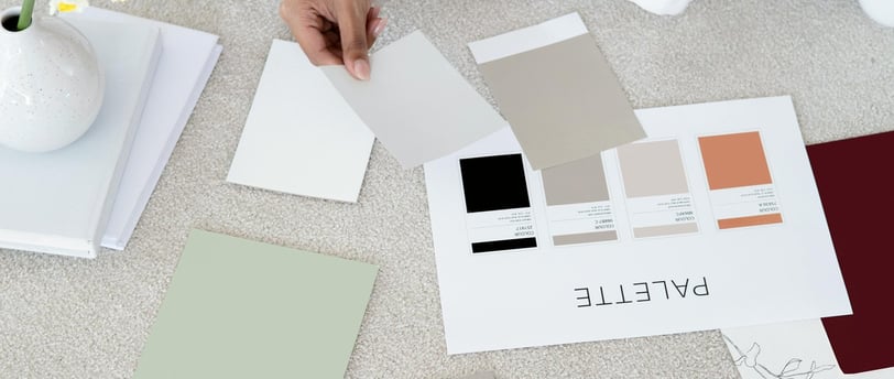
5 Steps to Correctly Test Paint Colours (and Other Interior Decor Samples)
Purchase larger paint samples: A4 is fine if you have many to sample. If you're down to just one or two, go for A3 if you can. The bigger the sample, the better idea you'll get.
If you can't buy samples, purchase test pots and get some pieces of plain white card (paint shops often have these).
Apply two coats of your chosen colour to each piece of card
Important! Leave an unpainted (white, raw card) border around the edge of each sample - about 2.5cm/1" is good - this helps minimise reflection from existing colours, which would affect your paint sample.
Use white paper behind your samples: If you purchased pre-painted samples instead of painting your own, the colour will come right to the edge of the board. Make sure you have some sheets of plain white paper on hand to put behind the swatches wherever you're testing them - again, to minimise reflection from the existing colours.
Remember to test your swatches in the correct direction:
Vertically (upright) for walls and cabinet fronts
Horizontally (flat) for floors, benchtops and ceilings. For these, testing at the right height is also imporant as the light changes substantially between floor, benchtop and ceiling height.
Observe your swatches at different times of the day and in different lighting conditions: morning, noon, evening, and when the curtains are drawn and the lights are on.
Move the swatches around, sampling how you like them with anything that will be staying in the room - especially higher value and permanent finishes such as countertops, cabinetry, furniture, flooring, drapes and artwork.
It's a process of elimination! You will quickly see which ones don't work with your other important finishes and which ones give off unexpected hues that you don't like. Narrow them down, and get bigger samples of the last couple if you feel you need to. By the time you've tested them with whatever else will be in the room, this process will help you decide which colour is best repeated in your fabrics and other finishes. This makes choosing colour so much easier than just slapping a sample on the wall and trying to choose based ONLY on how it looks - either surrounded by other samples, or on it's own.
But What About...? FAQ's
As with every to-do, every guide and of course every shade of every colour, there are nuances! Here are the answer to some of my most frequently asked questions:
Q. What about lighting, including which direction the room faces? Don't I need to get that right too, as it will alter the colour?
A. It's true, light will absolutely change how colour reads. Even natural daylight varies in colour from North to South, East to West. Did you know that the light is the Southern Hemisphere is actually bluer than the light in the Northern Hemisphere, which tends to be more yellow? Interesting information, but it won't actually help you decide which colour goes into your room. Because you're testing the colour IN your room, aren't you? And that's why it's SO important to never buy a tin of paint from falling in love with a colour on your pinterest board, on vacation, or for any other reason - without properly testing it first!
As for artificial lighting (the lights we turn on at night), it's best to choose your lighting first, before choosing your colours. Trying to alter a colour by changing the light can be tricky and usually only comes into play when tring to fix a 'mistake' (oops).
Q. What if this is a new build or complete renovation, so I'm starting with a blank slate and don't have other finishes to work with. Does this make it easier?
A. No! Choosing your paint first will make your job so much harder in every direction! Paint has the largest number of colour options available, more than any other finish out there. Choose your most expensive finishes first, and have everything match them - including the paint. You're welcome. You'll thank me later.
Q. Why can't I just use an app or online tool to check that I'm happy with the paint colour?
A. Proceed with caution! Using an app or online tool to test paint colours in your space - even when you've uploaded a photo of your room, can be a helpful indication of how the room will feel in a completely different shade. For example, when you're considering a bold change like drenching your white room in a dark, dramatic colour, they can give you a sense of how the overall feel of the room might shift. But remember—they don’t tell the full story.
Even when you upload a photo of your space, digital tools can’t account for how the lighting, finishes, or even the size of the room will affect the actual paint colour. So while they’re a fun place to start, you’ll still need to follow all the same steps for testing the paint in your real space to make sure it’s exactly right.
In Summary
Today we've learned that testing paint colours correctly is essential for achieving a result that reflects your vision - without wasting money on tins of ugly paint! By following these steps, you can confidently narrow down your options until you finding the perfect hue.
I've tried to include everything here, but if you still have questions, please message me!
And if you've followed all the steps but are still feeling uncertain, seeking a professional opinion can be invaluable. I offer quick, colour quick-fix services up to full home colour palette packages. See them here, or simply message me if you're unsure. Together, we can explore your options for creating a home where you'll love making memories in for years to come.