🎁 Give One, Get One FREE! Buy a Design Direction & Colour Story Package and get one FREE! Limited Spots - Claim Yours Today 🎉

2025 Paint Colours of the Year: Fun to Explore, But Would You Actually Use Them?
This year’s trending shades are bold, rich, and full of personality—but how do they work in a real home? Let’s find out.
COLOUR CONFIDENCECOLOUR STORIES & TRENDS
2/28/20256 min read


The Big Paint Brands Have Spoken, But Are Their 2025 Colours Actually Worth Using?
Every year, major paint brands predict the Colour of the Year—a single shade they believe captures the mood, emotions, and design trends of the time.
💡 "But what's the point? Aren't they just trying to tell us what we 'should' like?"
If you’ve ever wondered whether Colour of the Year announcements actually matter, or if they’re just another marketing gimmick, you’re not the only one! Some people love jumping on new colour trends, while others feel like they’re being told how to decorate their homes.
The truth is? These colours aren’t trends yet. They’re still just predictions. The real test? Whether people actually use them. And in my opinion, it's a fun opportunity to explore new ideas.
The colour doesn't just change your walls - it changes how your home feels.
So, let’s take a look at what’s predicted for 2025, what these colours say about the mood of the moment, and see if any of these picks are something you'd like to take home.


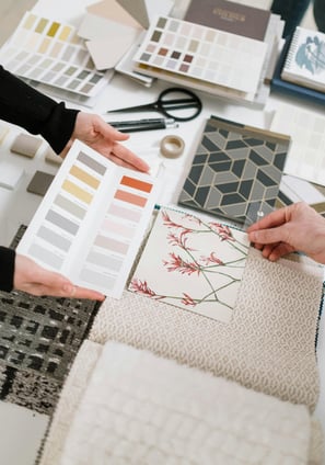
What Is the 'Colour of the Year' & Why Do Companies Choose One?
If you’ve never paid much attention to Colours of the Year, you might be missing out! It can feel like a big paint company telling you how to decorate, but let's explore.
Because in reality, these colours aren’t trends yet—they’re predictions based on:
✔ Cultural trends & world events (What people are craving in their spaces)
✔ Fashion & art influences (What colours are emerging in other industries)
✔ Emotional & psychological responses to colour (How we want to feel at home)
For example:
After a few unstable, high-stress years, we saw brands choose grounding greens & soft neutrals to create calm.
As creativity & self-expression made a comeback, we saw bolder, richer colours enter the mix.
So what’s the mood for 2025? Let’s take a look.


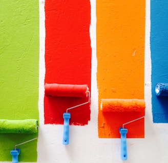
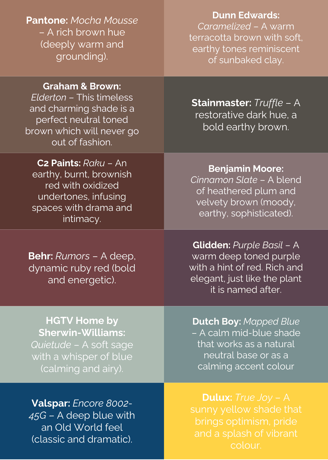
2025 Colours of the Year: What’s Trending?
Each brand has chosen a different shade, but a clear pattern has emerged:
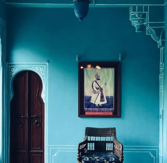
🎨 Warm, earthy hues—think deep reds, browns, and rich terracotta.
🎨 Moody, grounded colours—muted blues, greens, and purples.
🎨 A single wild card—a bold, sunny yellow that stands apart.
This year’s colours feel cosy, nostalgic, and deeply personal—a move away from cold, grey interiors. But do any of these speak to you?

But Would You Actually Use Them?
This is the big question, right? Sure, these colours look stunning in carefully styled photoshoots, but would they actually work in a real home?
Many people hesitate to use Colours of the Year because:
❌ They feel like a trend that will date quickly.
❌ They seem too bold or dark for their space.
❌ They don’t know how to make them work with their existing decor.
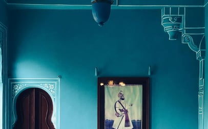
Take Valspar’s “Encore”—a deep, yet bright blue that’s shown completely enveloping a room from floor to ceiling. It’s bold. It’s dramatic. But in most homes, that much blue would feel overwhelming.
💡 The key isn’t to use these colours exactly as they’re shown. It’s to find a way to make them work for YOU.


Here’s How You Can Use Them in Real Life:
✅ Softened on the walls—Instead of drenching a whole room in dark blue, try it just on the walls or a muted version of the colour.
✅ In decor & furniture—A bold terracotta or deep green might be too much on the walls, but perfect for cushions, art, or statement furniture.
✅ Mixed with neutrals—Love Cinnamon Slate but afraid of going too dark? Pair it with warm whites and soft beiges to keep it balanced.
Colours of the Year aren’t about dictating trends. They’re about inspiration. If a shade speaks to you, there’s always a way to use it—without overwhelming your home.


What About New Zealand & Australia? Do These Colours Work Here?
Most Colour of the Year predictions come from Northern Hemisphere brands—but does that mean they translate seamlessly to homes in New Zealand and Australia? Not always.
Here’s why:
✔️ Our light is BRIGHT. The intense, clear sunlight in NZ & Australia makes colours appear sharper and more vivid than they do in softer European or North American light. That rich, moody blue you loved in a UK magazine? It might look twice as bright once it’s up on your walls.
✔️ We tend to favour neutrals. Whether it’s because of our modern architectural styles or simply the way colour behaves in our light, whites, greys, and soft naturals often dominate our homes.
✔️ Cool colours can feel crisp and fresh. While deep, warm tones are trending globally, in many Aussie and Kiwi homes, cooler or less intense shades of blues and greens tend to work better than intense shades of reds and oranges—especially in our bright, open-plan spaces.
How to Use These Colours in a Southern Hemisphere Home
💡 Go for muted over bold. If a deep aubergine or fiery red feels too strong, try a dustier, more subdued version of the colour instead.
💡 Test your colours in natural light. Paint swatches look different under artificial light vs. daylight—so always test them in the space.
💡 Consider how much colour you need. Instead of painting an entire room in a bold shade, introduce colour through just the walls, cabinetry, or decor.
Can’t Find These Colours in NZ? Here’s What to Do.
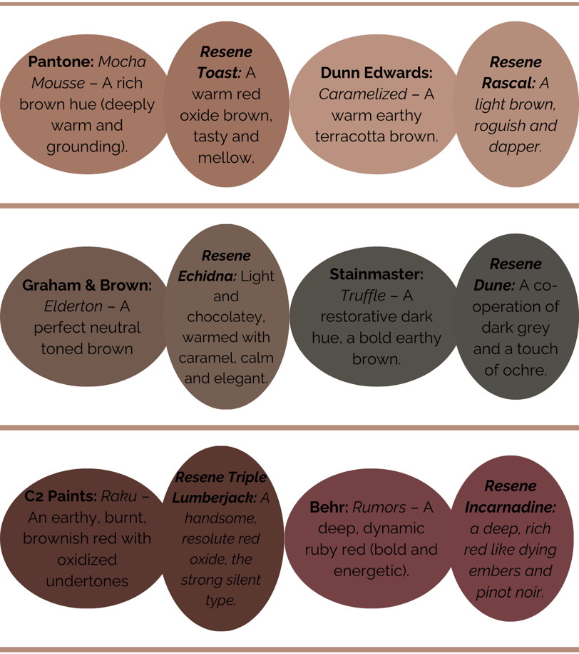
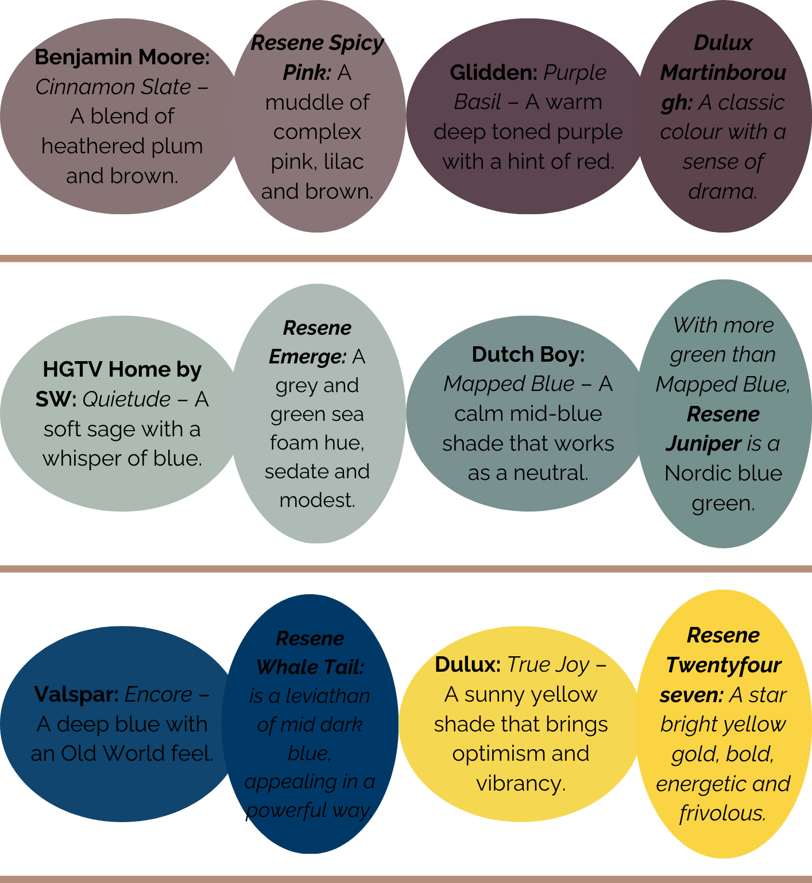
If you love a Colour of the Year but can’t get it locally, don’t worry! Most major paint brands offer similar shades. To get you started, I've picked out some close matches from Resene Paints:

How to Find a Colour You Actually Love
If none of these shades feel right to you, that’s okay! The goal isn’t to pick a colour just because some company has picked it—it’s to discover what makes your home feel alive.
Here’s where to start:
✅ Pay attention to how colours make you feel. Do you need calm, energy, or cosiness?
✅ Test colours in your space. A shade that looks great online might feel completely different in your lighting.
✅ Think beyond walls. Colour can show up in decor, furniture, and even small accents that shift the mood of a room.
And if you’re still stuck, that’s exactly what I’m here for. 💡
Which One Stole My Heart?
We're learning so much about the ability of colour to make you feel something. And this year, one shade instantly grabbed me:
💜 Cinnamon Slate by Benjamin Moore.
I wouldn’t usually go for purple or brown, but something about this shade feels different. It’s deep, grounding, and has just enough warmth to feel inviting rather than heavy.
And I've been pondering it since - considering throwing it into the mix as we re-decorate our home. But it's an interesting one - because neither purple nor brown fall into my list of favourite colours. But what I do have in my favour with Cinnamon Slate is that it's pretty neutral (meaning it will work with SO many other colours, including many of my favourites). So although it's taken my by surprise, it's certainly inspired me to give it a shot somewhere in my home.
But that’s the beauty of colour—it’s personal. You don’t have to follow trends. You just have to find what sparks joy for YOU.
Benjamin Moore: Cinnamon Slate – A blend of heathered plum and velvety brown (moody, earthy, sophisticated).
Need Help Choosing the Perfect Colour?
Colour trends are fun to explore, but at the end of the day, your home should reflect YOU—not just what’s “in” this year.
If you’ve been staring at swatches for weeks and still feel unsure, that all ends here! Finding the right colour for your space can be overwhelming—but it doesn’t have to be.
That’s exactly what I’m here for. Whether you need a quick second opinion or a little expert guidance, let’s make colour exciting instead of stressful.
👉 Need help picking a colour? Click here to get started or send me a quick message.